01. About SprintMoney
SprintMoneyTM researches & identifies the best suited investment options based on past performance, risk ratios, forward outlook and more to recommend a personalized basket of funds curated specially for its users.
The application recommends curated financial investment solutions to its users based on their profile and preferences.
SprintMoney leadership team is a group of highly experienced members from Banking, Insurance and Finance industry with more than 20 years of experience.
02. Introduction
The , color palette, and typeface are three of the most important elements for identifying its brand. Their consistent use is important for maintaining the brand all over.
This style guide will serve as a SprintMoney design standard reference for an integrated design team involving documentation, development, usability, graphic design, marketing, and other relevant sources.
This user interface style guide will serve as:- A tool for ensuring consistency across a product set,
- A branding standard for Marketing and artworks created for that matter,
- The repository for design guidelines and standards.
- A training aid for new members of the product team.
This style guide is a live document which will be updated as and when there are modifications in branding UI standards.
03. Logo
Logo Design Process and Isolation
SprintMoney logo should always be surrounded by a minimum area of space. The area of isolation ensures that headlines, text or other visual elements do not encroach on the logo.
 SprintMoney logo isolation area. This area of separation is a minimum and should be increased wherever possible.
Minimum Size
There are no predetermined sizes for the SprintMoney logo. Scale and proportion should be determined by the available space, aesthetics, function and visibility.
There is no preset maximum size for the logo. However, minimum sizes are shown below. These sizes have been set to safeguard the integrity of the logo at all times.
Master Logo
SprintMoney master logo should be used at all times. Where not possible, one of the logo variations should be used (see below). This is to make sure the logo and brand are used in a consistent manner across all communications.
Logo Icon
SprintMoney icons can be used in different color versions. You can use icons on a background color from the primary palette.
Logo Variations
SprintMoney logo has been designed so it can be used with any of our Primary and Secondary Color Palette. This allows the logo and brand to be flexible in it's usage. With strong use of color being used throughout all of our marketing communications it is essential that our logo has the flexibility to work with all of our brand assets.
04. Color Palette
Primary Colors
The Primary Palette should be used in all occassions for SprintMoney marketing communications. The palette has been designed to give a bold and exciting direction to the brand, offering flexibility in the design of an literature off and online. Percentage tints can be used of any of these colours.
color
Hex#23DB7B RGB35,219,123 CMYK84,0,44,14
color
Hex#6C63FF RGB108,99,255 CMYK58,61,0,0
Hex#64DBFF RGB100,219,255 CMYK61,14,0,0
Hex#3C3E42 RGB60,62,66 CMYK9,6,0,74
Shades of grey
A selection of grayscale colors for background or text color use.
Hex#3C3E42 RGB60,62,66 CMYK9,6,0,74
Hex#7B7B9D RGB123,123,157 CMYK22,22,0,38
Hex#ACB4BF RGB172,180,191 CMYK10,6,0,25
Hex#D1D6DD RGB209,214,221 CMYK5,3,0,13
Hex#FFFFFF RGB255,255,255 CMYK0,0,0,0
05. Typography
Roboto should be used for all header, sub header text and other copy (body, quotes etc). To ensure a consistent look, make sure fonts are used in a consistent manner and the weights of the font have been considered, using heavier weights for headers and the highlight key messages.
Listed font family should be used for all communications to ensure the consistent look and feel of all literature offline and online.
Font Family:Roboto
Light Regular Medium Bold
Aa
abcdefghijklmnopqrstuvwxyz
abcdefghijklmnopqrstuvwxyz
123456789!@#$%().,
Aa
abcdefghijklmnopqrstuvwxyz
abcdefghijklmnopqrstuvwxyz
123456789!@#$%().,
Aa
abcdefghijklmnopqrstuvwxyz
abcdefghijklmnopqrstuvwxyz
123456789!@#$%().,
Web Styles
Page Title H1
Section Title h2
Section SubTitle h3
Sub Section Heading h4
common text h5
common text h5
common text h6
common text Subtitle 1
common text Subtitle 2
common text Subtitle 3
SprintBrains AI engine has selected the following Smart Combo of Mutual Funds and Term Life Insurance best suited for you
Builds wealth for your family even when you’re not around.
common text caption
common text overline
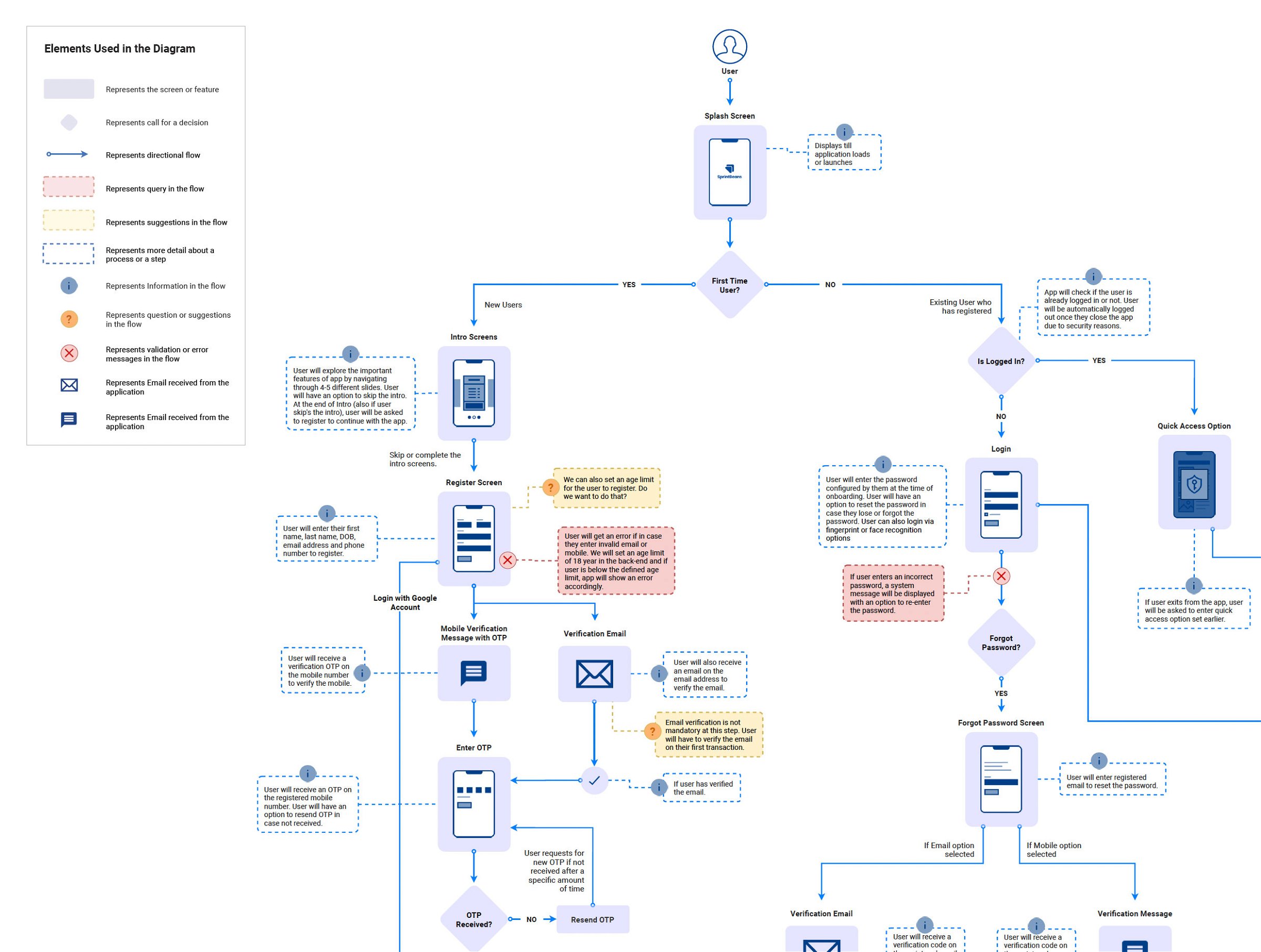
06. User Flow
User Flow diagram gave us clarity and helped us in defining how the user is going to navigate throughout the app and what actions will be performed on each screen/interface.
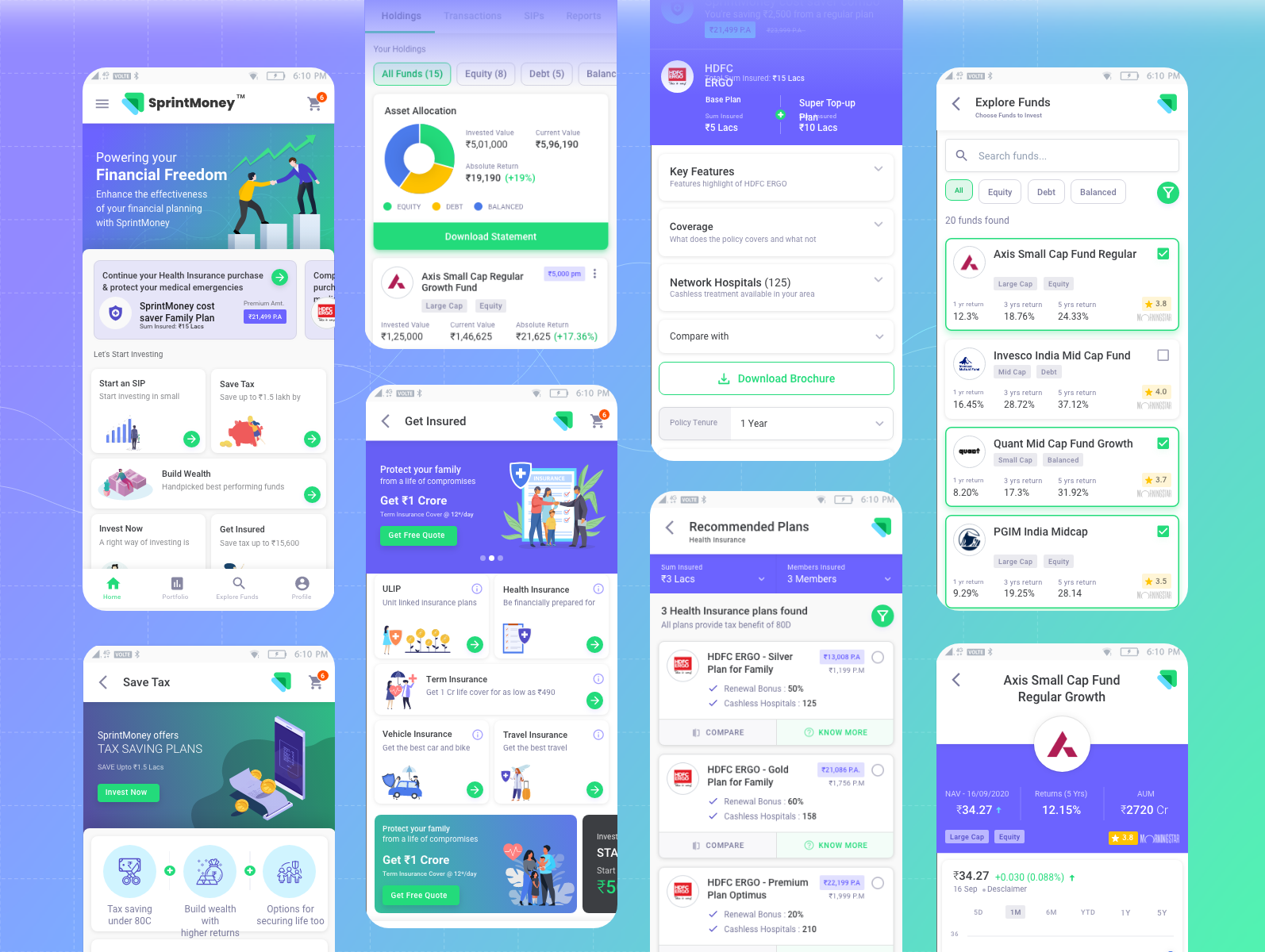
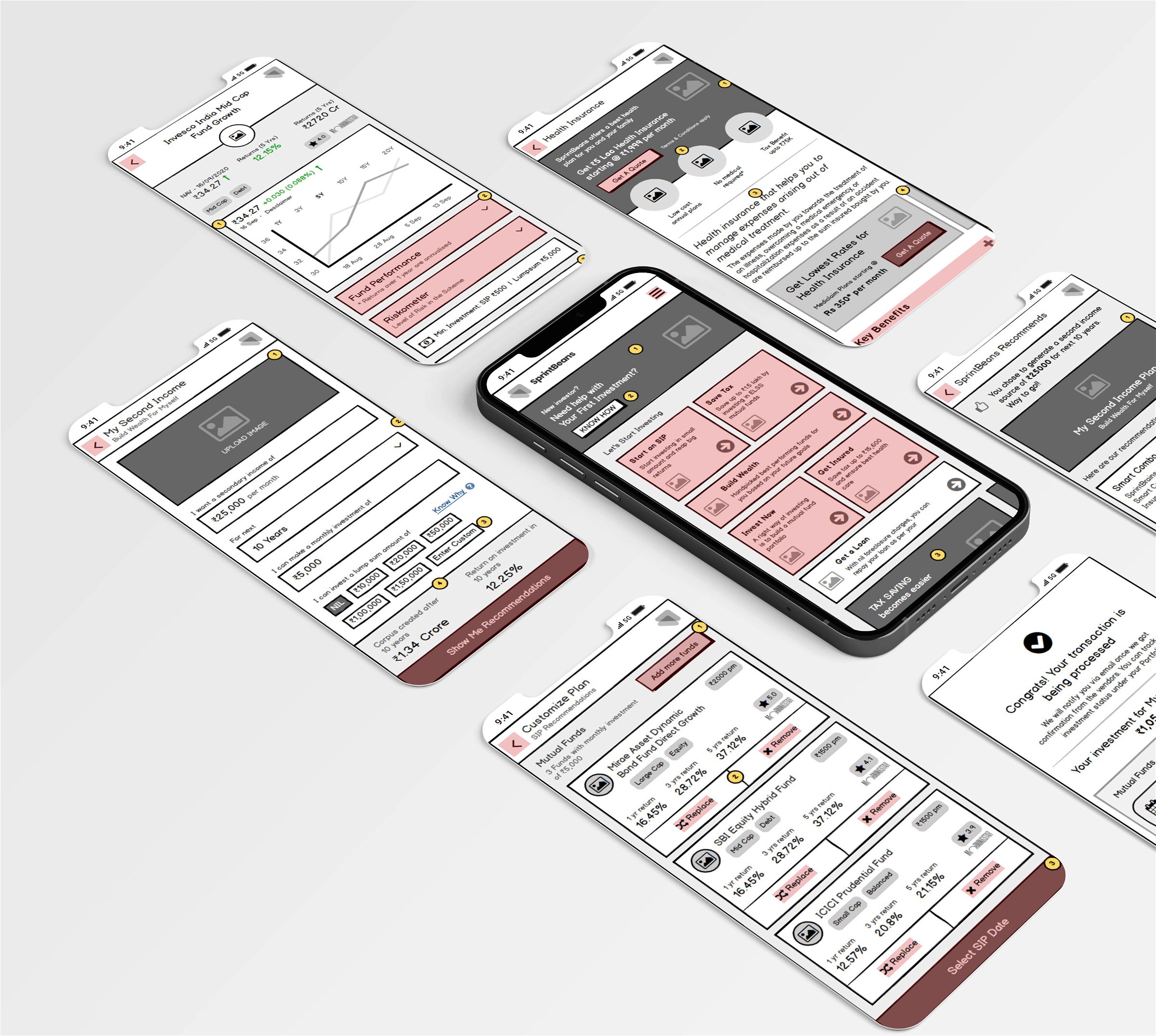
07. Wireframes
Wireframe sketches were created to explore possible layouts, comparing various UI elements for representing the content/data and defining the content needs.
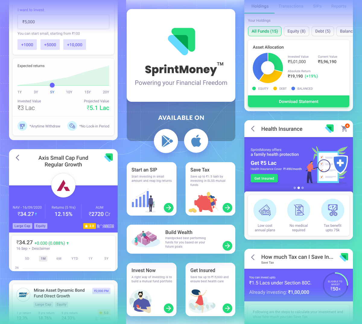
08. UI Components
UI Components are the reusable building blocks of our design system. Each component meets a specific interaction or UI need, and has been specifically created to work together to create patterns and intuitive user experiences.
09. Illustrations & Icons
ILLUSTRATIONS
Illustrations help convey complex ideas in a simple way. They should be meaningful and reflect a user's context and emotional state.
Our illustrations range from detailed hero images down to in-product spot images with a consistent narrative of practicality, optimism, and friendliness used throughout. This is accomplished through shape, color, softness, and curves to achieve an inviting, engaging experience.

ICONS
Icons should be used in a purposeful manner to maximize comprehension and reduce cognitive load when you need to call attention to a particular action, command, or section. Use them infrequently – if you’re questioning an icon’s use, it probably doesn’t need to be used at all.
Our icons are designed with our brand personality baked in, aiming to balance our human side with function.