3 minutes read
How Data Visualization Leads to Business Intelligence?Many a times people use terms like Analytics, Business Intelligence, Data Visualization, interchangeably. I don’t blame them as they are indeed connected with each other but each one stands for itself and has a specific role to play in the entire ecosystem.
Let’s look at their general definitions first.
Analytics is the discovery, interpretation, and communication of meaningful patterns in data.
Business intelligence (BI) can be described as “a set of techniques and tools for the acquisition and transformation of raw data into meaningful and useful information for business analysis purposes”.
Data visualization is a general term that describes any effort to help people understand the significance of data by placing it in a visual context. Patterns, trends and correlations that might go undetected in text-based data can be exposed and recognized easier with data visualization.
Better? Nope. Let’s put them together in one sentence.
Visualizing business data (data visualization), the right way helps you find meaningful patterns in data (analytics) to analyze your business and make decisions (business intelligence).
Data Visualization -> Analytics -> Business Intelligence
Little better? May be. Let’s explore it with an example.
Suppose you are the VP Logistics at a large enterprise and you supply your material in hundreds of districts / cities. Now you need to quickly find the trend of volume (or price) in various districts and at the same time need to find out which districts are growing, stagnant and shrinking overall. You need all of these insights (and a few more) in one page to make quick business decisions.
You have the data in tabular form from multiple sources but it is of little help. So now how does a meaningful Data Visualization leads you to Business Intelligence in this case?
Imagine a following Data Visualization, which lets you analyze the sales trends in multiple districts (hundreds of them) in one screen.
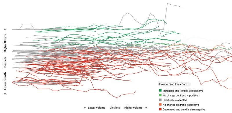
It is essentially a scatter plot for districts with Growth on Y-axis and Volume on X-axis. But districts are plotted as line charts instead of dots, representing a trend of volume and price for a district over the period of one year.
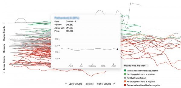
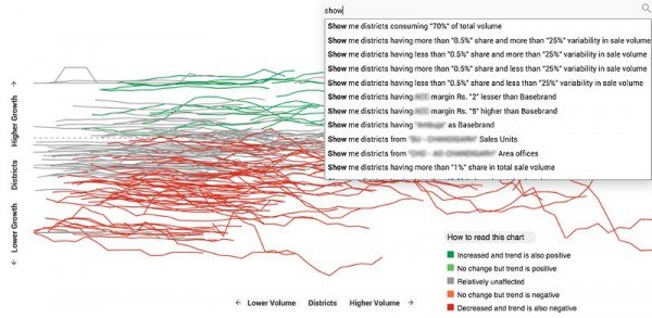
Add intelligent search to this and now you can find answers to various questions (automatically generated) for this data.
I believe following makes more sense now.
Data Visualization -> Analytics -> Business Intelligence
A meaningful Data Visualization of your data leads to better Analytics and thus effective Business Intelligence.
At BA Apps, we pride ourselves in creating such meaningful business analytics apps for startups, small businesses and enterprises.
Abhishek
- Posted on July 28, 2016