7 minutes read
Designing Software InterfacesBefore we get into the details of how part, let us first try to know what actually does the word interface mean.
As stated in Thesaurus,
Interface: connect, combine, integrate, merge, mingle, unite, join together and few more…
In computer science,
Interface is a program that controls a display for the user (usually on a computer monitor) and that allows the user to interact with the system.
If we further extend the meaning in context of design interface,
Designing interface is a process where you logically structure the program so that the resulted display is easily understood and easily usable by the user.
An interface design is good if it is clear, user is able to recognize what it is all about, she cares to use it or knows why to use it, it is easy to understand and interact with and, predictable too.
As a designer, there are few unbreakable rules or laws that I follow or keep in mind while designing any interface. These rules are very much logical in nature and no rocket science. I strongly believe that any designer who aims at creating usable interfaces can or must be following these.
Identify your user and try to know them better
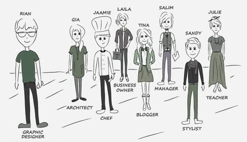
This is first question that I ask whenever I’m starting with a new design assignment. Knowing whom you are creating the interface for is very important. This rule falls true for anything new that is being created. We do it in our day to day lives too, let us take an example.
If I’m about to cook a recipe, first thing I need to know is – Who is going to consume it? A child, an adult? If its a child how old is she, does she like her food to be sweet or blend or tasty? If I dig in more, Is this going to be consumed as a breakfast or lunch or dinner?
The chances of my recipe being consumed & liked after considering few of the above points are much higher than just cooking out of the blue as per my taste. Agree?
Clear & Simple Interface
To be effectively using an interface you’ve designed, user must be able to recognize/identify what it is, care about why they would use it, understand what the interface is helping her interact with, predict what will happen when she uses it, and then successfully interact with it. But remember, clear and simple interface does not mean you exclude elements that would actually have been of use to the user. For example If Sign up or Sign In is a primary action for a user to enter your web application interface try not to keep it hidden behind an icon or in a drop down just to make your screen look clean and minimalistic!
Consistency to enable easy interaction
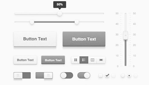
Consistency in an interface can be achieved by using common elements throughout. This way user will feel more comfortable and would be able to get things done more quickly. It can be achieved by following a similar pattern, theme, color, font etc throughout the interface. The example of this too can be found around us.
In your house, there must be switch boards in every room. They must be same in look and feel, in size, and the way they function too right! Imagine there were different switch boards(in shape, the way they function etc) in every room of your house, it would have been trouble to get used to them for sure.
The focus should be that user learns how to do something from first instance, and she should be able to relate it with other parts of the interface.
Context
User will always expect to see interface elements in the context of object (close to the object) she wants to control. Taking the same example of switchboard, the switch to turn on/off your living room fan can be found in the living room area and not in a kitchen or anyplace in your bed room.
Remember to keep things handy for users — if something can be edited, changed or controlled, place the controls right next/near to the element itself.
Layout structure
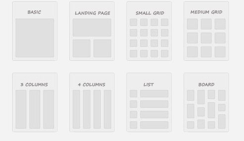
It is very important and wise to consider the spatial relationships between items on the page and logically structure the page based on importance. Careful placement of items can help you draw users attention to the most important pieces of information and can aid scanning and readability. This is more like guiding your user or taking her through your interface the way you want. Few ways to achieve this on a webpage interface would be usage of Heading tags, separators, boxes, sections, etc.
Guide the user to keep her in control
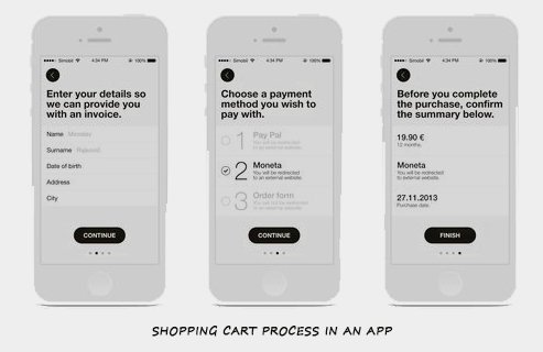
I call it progressive disclosure. Show only what is necessary on each screen. If user is making a choice, show enough information to allow her the choice, then dive into details on a subsequent screen.Avoid the tendency to over-explain or show everything all at once. This can be one of the ways to keep your interfaces simple & clear.
Relate this with how a typical 5 course meal is served, the items are served one at a time from soup, to starters to salads to main course and finally the desserts!
Creating call to actions and differentiate clearly between primary & secondary actions
We can also term this as a guided action. The user will probably do something only if she is asked to do it. There is a huge difference between expecting users to do something on their own, and asking them specifically to do it. Don’t assume actions. Few things would be logical for you only because you have designed it or are working on it since long!For example if your shopping cart interface demands a login before the user gets to purchase an item, show her the Log in screen and ask her to do so. Taking the user back to the home screen or not allowing her to add the item in her cart won’t help her at all!
You also need to give proper attention on and differentiate visually the primary & secondary action elements on your interface. For example in after filling any given form, the general actions can be to Submit/Save, Cancel or Reset it. Here the Primary action would be to Submit/Save and secondary actions would be Cancel or Reset. Design/Differentiate them accordingly.
Play with Typography, Color palette is not an only option available!
As a designer I always explore ways to represent the elements on the interface I design. You can direct attention to or redirect attention away from items using color, light, contrast, and texture to your advantage. But note that colors are not the only way to highlight elements on your interface. Try typography instead.
You can very well use typography to bring hierarchy and clarity in your interface. Idea is to carefully consider how you use typeface. Use of different sizes, fonts, and arrangement of the text will help you increase scan-ability, legibility and readability in your interface.
And then there are rules which are important to make your interface a good interface, but are often overlooked by designers, couple of them include
Considering the blank state
This is all about – What will your user see when she first time logs in the interface that practically has no data? Or in any given shopping cart interface what will she see if there are no items in a particular category. Do you remember how did your Facebook page look when you had no feeds, friends or information on to it? It guided you to create your profile, invite your friends and get started with your first post! It wouldn’t have been easy for you to set up your profile & get going if Facebook team had not considered the blank state or interface with no data view!
Thank you “getting real” for teaching me this.
Preparing for unexpected actions
Don’t forget to consider those unexpected actions which your user is likely to perform under unexpected scenarios. One example of unexpected action would be typing a wrong page URL while navigating a site. Now if this page does not exist on your site, what should a good interface show? Well, it should show a “404 error – Page not found” with proper navigation links for user to move ahead and get going!
If understood well, the above rules are much simpler and logical in nature. They can easily be applied while creating any interface.
As a designer I always take it as my duty and responsibility to design interfaces that are usable. I don’t consider my job as done once I complete designing an interface, I consider it done when the users actually are able to use it! Why? Simply because Interfaces exist to be used.
Just like you expect a chef to come up with a recipe which not only looks tempting enough to the eyes but tastes great too, an interface design can be as much about creating an environment for use and worth using.
A note: The rules and points I listed above are true not only for designing screen based interfaces but also for few tangible designs we come up with for our customers.
A disclaimer: The article you just read is based on my experience of designing interfaces in past 8 years, many designers I’ve worked with or even interviewed, and many blog articles, sites (Good UI, Smashing Magazine) and books I read and refer to (Don’t Make Me Think by Steve Krug, Designing Interfaces: Patterns for Effective Interaction Design by Jenifer Tidwell ) in my learning phase.
Supriya Agnihotri
- Posted on February 11, 2015

